 Lucas Oliveira
Most landing pages fail because they lack a clear psychological flow. This guide reveals the exact seven structural elements that drive conversions, from headline to CTA, backed by 2026 data and real examples.
You spent $5,000 on paid ads last month. You got clicks, maybe a few page views. Then your landing page turned that traffic into tumbleweeds.
Sound familiar?
The problem isn't your offer. It's that your landing page lacks a clear psychological flow. Most pages are built like brochures, not conversion engines. They confuse visitors instead of guiding them toward a single action.
After studying hundreds of landing pages across dozens of niches, I can tell you the difference between a page that converts at 3% and one that hits 12% or more comes down to seven structural elements. Here they are, no fluff, just what works in 2026.
1. The Hero Area: Headline, Subheadline, and Primary CTA
Your visitor decides whether to stay in under five seconds. The hero area has one job: make it blindingly obvious what they get and what to do next.
The headline must state the single core benefit in plain language. No puns, no brand taglines. Use a proven formula: [Benefit] + [Specific Outcome]. For example, “Increase Your SaaS Trial Signups by 40% in 30 Days” beats “Grow Your Business.”
The subheadline reinforces the promise. It adds a layer of proof or context. Airbnb nails this with “Book unique places to stay and things to do.” Simple, benefit driven, and instantly clear.
Your primary CTA belongs above the fold. One CTA outperforms multiple by 266%. I have seen pages with two buttons fight each other and lose. Use action oriented language: “Start My Free Trial,” “Get My Custom Report,” “Book My Call.” Avoid generic “Submit” or “Learn More.”
Place your form fields alongside the CTA. Email only forms can lift conversion to 13.4% compared to multi field forms. Ask only for what you need right now. You can collect the rest later with progressive profiling.
2. Social Proof and Trust Signals That Build Credibility
Visitors are skeptical. They have been burned by promises before. Social proof is the antidote.
Include authentic testimonials with real names, photos, and specific results. Vague praise doesn’t move the needle. A client of mine implemented a testimonial section with concrete metrics like “Increased qualified leads by 124% in two weeks” and saw a 282% lift in conversions overnight. That’s the power of specificity.
Trust badges, security icons, and logos of known clients add 34 to 42% uplift in conversions. Position them near your CTA. Airbnb uses “Guest favorite” badges and verified reviews. Microsoft 365 places a “Free trial” button right where the eye lands first, reinforced by recognizable brand trust.
Use case study snippets or stats like “4.8 out of 5 stars” to lower perceived risk. In 2026, AI driven pre search rewards pages with recent, verifiable social proof. Outdated badges hurt credibility. Keep your testimonials fresh, ideally from the last three months.
For more proven examples, check our analysis of 9 Meta ad hooks that work and see how social proof drives clicks.
3. Value Proposition and Benefit Focused Copy
Beneath the hero, you need to restate your unique value in plain language. Your value proposition answers: “What makes this offer different and why should I act now?”
Use bullet points to break down key benefits. Keep paragraphs short and scannable. Avoid jargon. If you sell a loan matching service like HomeLoanGurus, explain in two sentences how it works, then list three benefits with bullet points. No one reads long blocks of text on a landing page.
Address common objections with a brief FAQ or “FUD” section (fear, uncertainty, doubt). For example, if customers worry about security, add a line: “256 bit encryption. Your data never leaves our server.” Reduce hesitation before it forms.
Your copy must align with the visitor’s intent. In 2026, people research via AI assistants before clicking. By the time they land on your page, they already know the problem. Your job is to confirm that your solution matches their need. Calm does this perfectly: “The #1 app for sleep, meditation, and relaxation.” No guesswork.
Learn more about crafting value propositions that stick in our guide to A/B testing landing pages.
4. Frictionless Forms and Mobile First Design
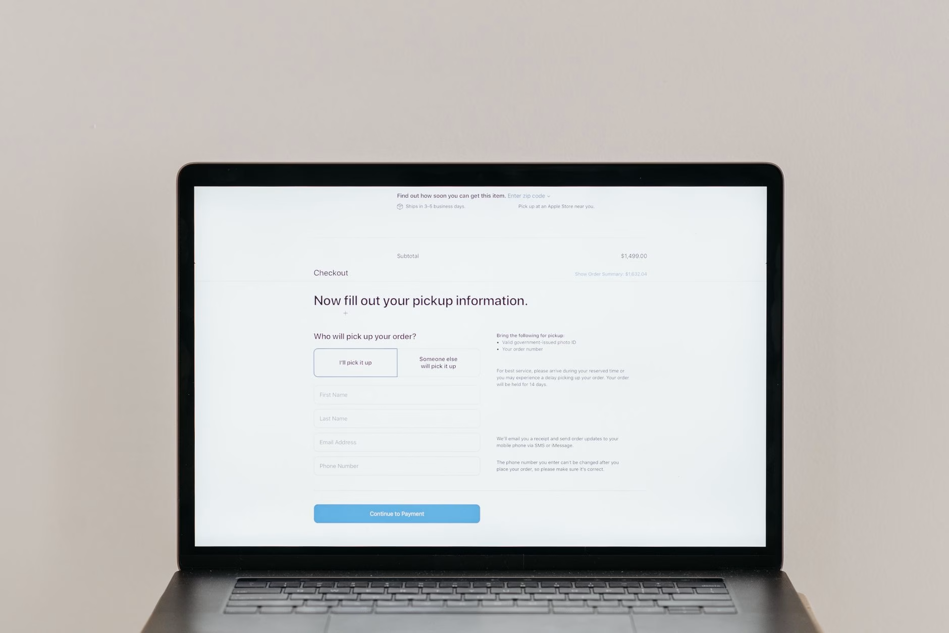
Every form field is a tax on conversion. Reduce your form from five fields to three and you can boost conversions by 50%. Name and email is the sweet spot. If you need a phone number, make it optional.
Place the form above the fold or repeat it strategically after the hero section. Use inline validation to show errors as users type, not after they click submit. That alone can reduce form abandonment by 20%.
Your page must load in under two seconds. Compress images, minify scripts, and use a fast hosting provider. Every second of delay costs you 7% of conversions. Tools like Convertri or Unbounce are built for speed. If you code your own, use a CDN and lazy load below fold content.
Design for mobile first. Single column layout. Large touch targets (at least 44 pixels). Readable fonts at 16px or larger. Test on real devices, not just Chrome DevTools. Mobile traffic is over 60% of web traffic; if your page is not thumb friendly, you are bleeding leads.
5. Urgency and Scarcity Mechanisms
Urgency nudges visitors who are on the fence. But it must be genuine. Counterfeit urgency erodes trust and hurts your brand. Real scarcity works: limited time discounts, low stock alerts, or countdown timers for a launch window.
Countdown timers can add a 9% lift in conversions. Place them near the final CTA, not scattered across the page. One timer is enough. Couple it with a clear deadline: “Offer ends in 2 hours. Reserve your spot now.”
Personalized CTAs boost results by over 200% compared to generic “Submit.” Instead of “Get Started,” use “Start My Free Trial” or “Claim My 20% Discount.” Personalized language makes the action feel custom.
Use urgency sparingly. If every page screams “limited time,” you train visitors to ignore it. Save it for genuine launch events or seasonal offers. For more on response time and urgency, read why a 5 minute lead response doubles sales.
6. The Bottom Fold: Reinforce and Remove Distractions
Some visitors scroll to the bottom. They need more convincing. Include a final summary of benefits and a secondary CTA near the bottom. Restate the core value proposition one last time. Then make the ask again.
Remove all navigation links and external distractions. The page should have only one goal. No header menu, no footer links to blog or services. Every link that is not part of the conversion path is a leak. You want total focus.
Add a short video testimonial or explainer. Video can increase conversions by 86%. A real customer sharing their result in 60 seconds is worth more than paragraphs of copy. Keep it authentic. No slick production, just genuine proof.
Test continuously. A/B test your headline, CTA copy, form length, social proof placement, and visual hierarchy. What works for one audience may not work for another. The top converting pages from Unbounce customers reach over 30% conversion rate because they never stop iterating. See our creative testing system for a repeatable process.
Paramount+ uses a scroll triggered design that keeps engagement high. Good Eggs runs a restrained promo for free coconut water and nothing else. Both use the same principle: remove everything that doesn’t serve the conversion goal.
Where to go next. You now have a battle tested structure for your landing page. The seven elements work together to create a psychological flow that guides visitors from confusion to action. But knowing the theory is only half the battle. The other half is execution and ongoing optimization.
If you would rather skip the guesswork, we can audit your current landing page and ad funnel in minutes. Our free AI audit shows exactly where your site and funnel are leaking leads, no strings attached. See exactly where your site and funnel are leaking leads, in minutes.
Cover photo by Mahmoud Ramadan on Pexels.
Frequently Asked Questions
How many form fields should a landing page have? +
Aim for three fields maximum, ideally just name and email. Reducing from five to three fields can boost conversions by 50%, according to 2026 benchmarks.
What is the most important element of a landing page? +
The headline. It decides whether the visitor stays or leaves within seconds. A benefit focused headline paired with a clear subheadline and a single primary CTA above the fold sets the foundation for all other elements.
How long should a landing page be? +
Length does not kill conversions. Bad structure does. Short pages work for simple offers. Complex offers may require more sections to address concerns and build trust. Scannable copy, bullet points, and visual hierarchy matter more than word count.